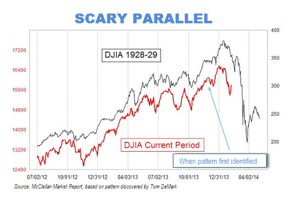
Scary Parallels to Dow Jones Industrial Average 1928-29 Chart and Now?
Q: I have read a couple of blogs recently that highlight frightening parallels between charts of the Dow Jones Industrial Average from 1928-29 and the most recent period. The similarities are stunning and it’s making me very nervous now as the chart suggests we’ve begun a steep down cycle as began in 1929. What do you think of this?
A: Honestly, the analysis I have reviewed leaves much to be desired.
I have examined the chart in question (below) and one thing jumped out to me right away over the approximate 18-month period the chart covers. In the 1928-29 period, the Dow approximately doubled in value from just under 200 to around 380. Over the recent period, the Dow only increased about 30 percent.
After peaking in late 1929, the Dow then plunged nearly 50 percent in just a few months. The folks pointing out the chart parallels between 1929 and today imply that if the pattern holds, a crash is just ahead. A 50 percent drop from the recent highs of Dow 16,588 would reduce the Dow to about 8,294. However, they fail to recognize that if the “pattern” indeed holds, the Dow would simply drop to about 12,500 because of the point and percentage differential between the two periods I discussed above.
Of course, the 1929 crash didn’t result in the U.S. stock market “only” dropping by about one-half. That bear market, which lasted from 1929 through 1932, resulted in a stunning 89 percent decline from peak to bottom. The chart fear mongers thus are implying if a similar crash happens today, the Dow would fall from 16,588 to about 1,825 – a level last seen back in 1988 when Ronald Reagan was President.
The other issue that I find stunning that no one has raised is the fact that the 30 stocks that comprise the Dow Jones Industrial Average today have little overlap with the 30 stocks in the Dow in 1929. General Electric and Standard Oil of New Jersey (which became Exxon) is the only real overlap. Consider some of the 1929 Dow stocks which included American Smelting, American Sugar, General Railway Signal, International Nickel, National Cash Register and Woolworth. So, in comparing a Dow chart of today to 1929, we are clearly comparing apples with oranges.
The bottom line here is that I wouldn’t lose any sleep over supposed chart similarities between 1929 and today. That said, a correction of some sort is certainly a possibility in 2014 for the simple reason that it has been quite a while since we’ve had a correction of 10 percent or more. The last such correction happened in the summer of 2011.


